Polk BOCC
Polk County Reveals Its Competitive Advantage with a Revamped Visual Identity
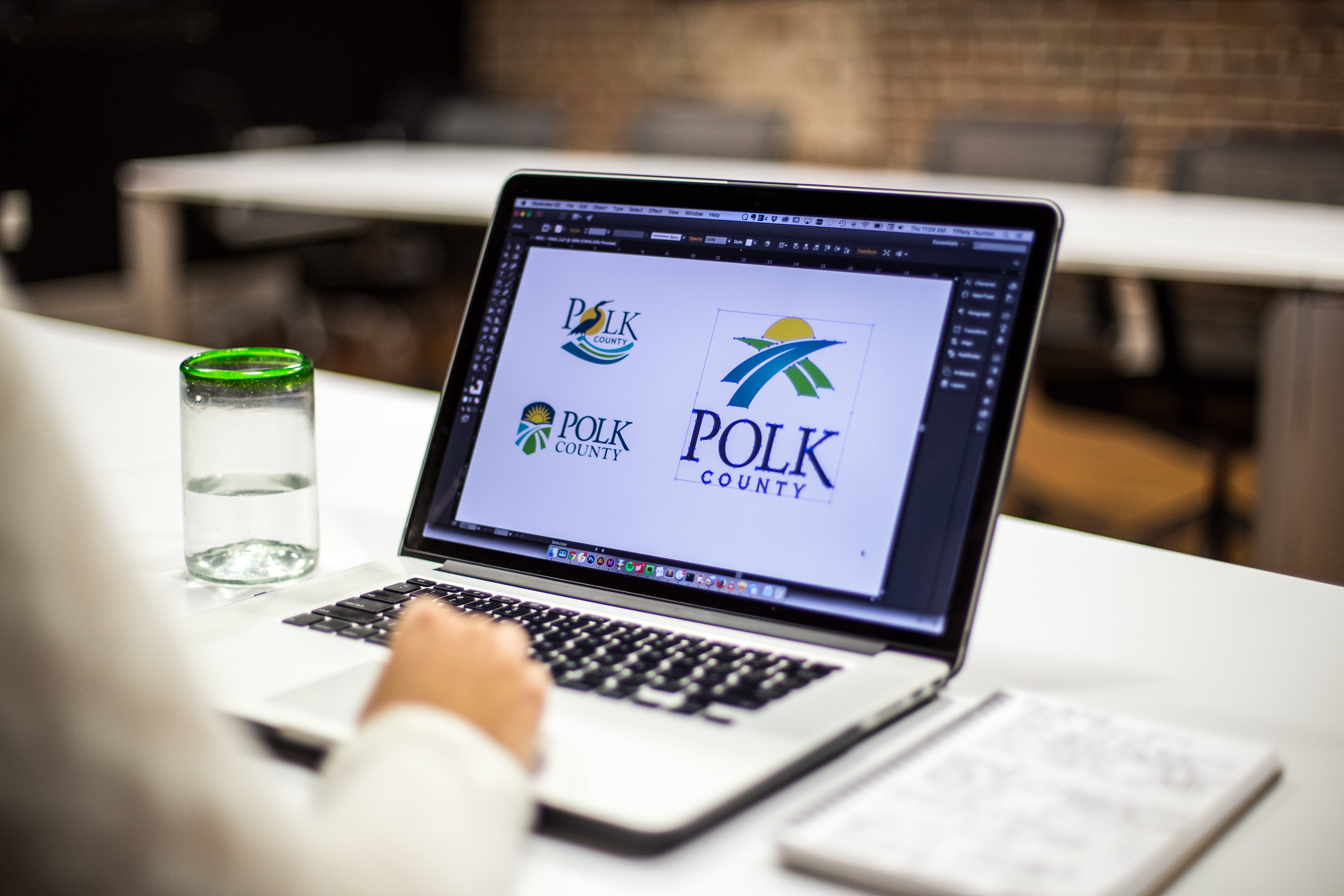
Home to the state’s first Polytechnic university and a major player in Florida’s High-Tech Corridor, Polk County has come a long way since its citrus and cattle days. But you’d never know from the county’s longtime logo: the Official Seal of Polk, which features quaint-but-dated icons of the area’s past. It was high time for a reboot — starting with an original logo and tagline highlighting the opportunity and growth potential of present-day Polk.
Services & Expertise Brand Development, Content Strategy, Marketing Strategy
Industry Tourism & Travel
The Brief
Position Polk County as an up-and-coming business hub with a new identity that speaks to the future instead of the past.

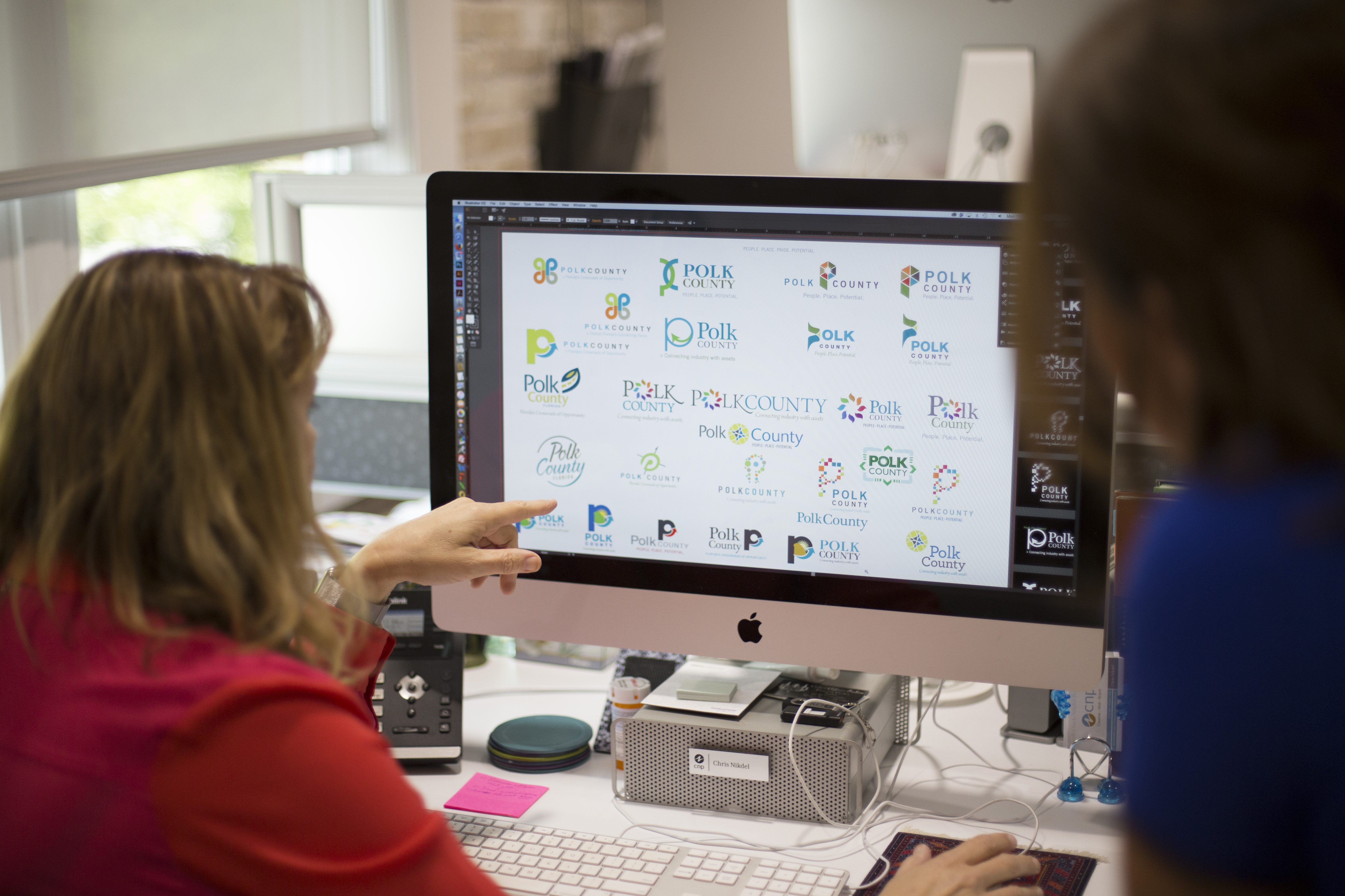
The Approach
Lay the foundation with a solid brand platform and build from there. After a series of discovery sessions with the Board of County Commissioners, we set out to find Polk’s authentic kernel of truth, pop it into a logo, and drench it with design butter and brand salt. You know, make it tasty.
AN ENVIABLE POSITION
CAPTURING MARKETING MOMENTUM
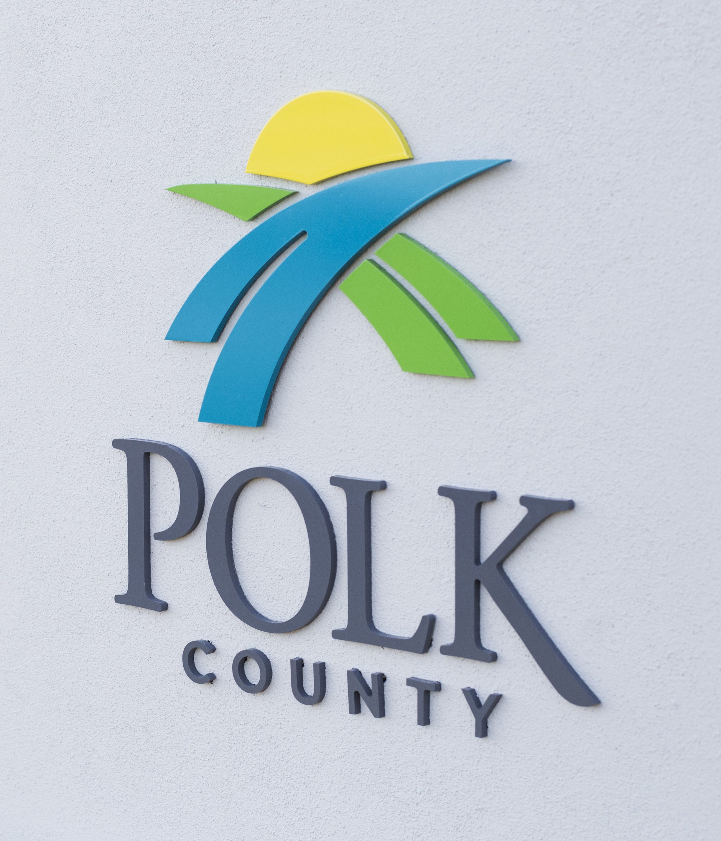
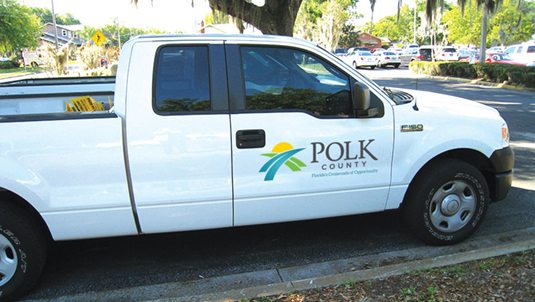
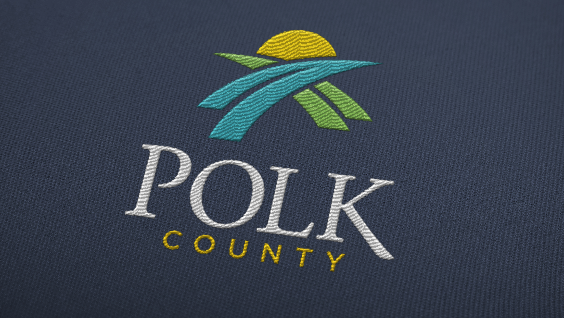
EASY TO USE – EVERYWHERE

Where do you live? “Somewhere between Tampa and Orlando.”
No longer just a way-finding technique, but a defining (and highly marketable) characteristic of our new identity: “Florida’s Crossroads of Opportunity.”
“With CNP’s help through the creative process, we were able to better define the people, places and potential of Polk County, which was important in developing new branding with a logo that speaks to who we are today.”